ABOUT US
Say Less is a Digital Design Studio. We specialize in creating beautiful, colorful, and stylish brands.
Two Locals Brewing Co.
Habelo Beauty
Kinfolk Bride
Ethos GSFM
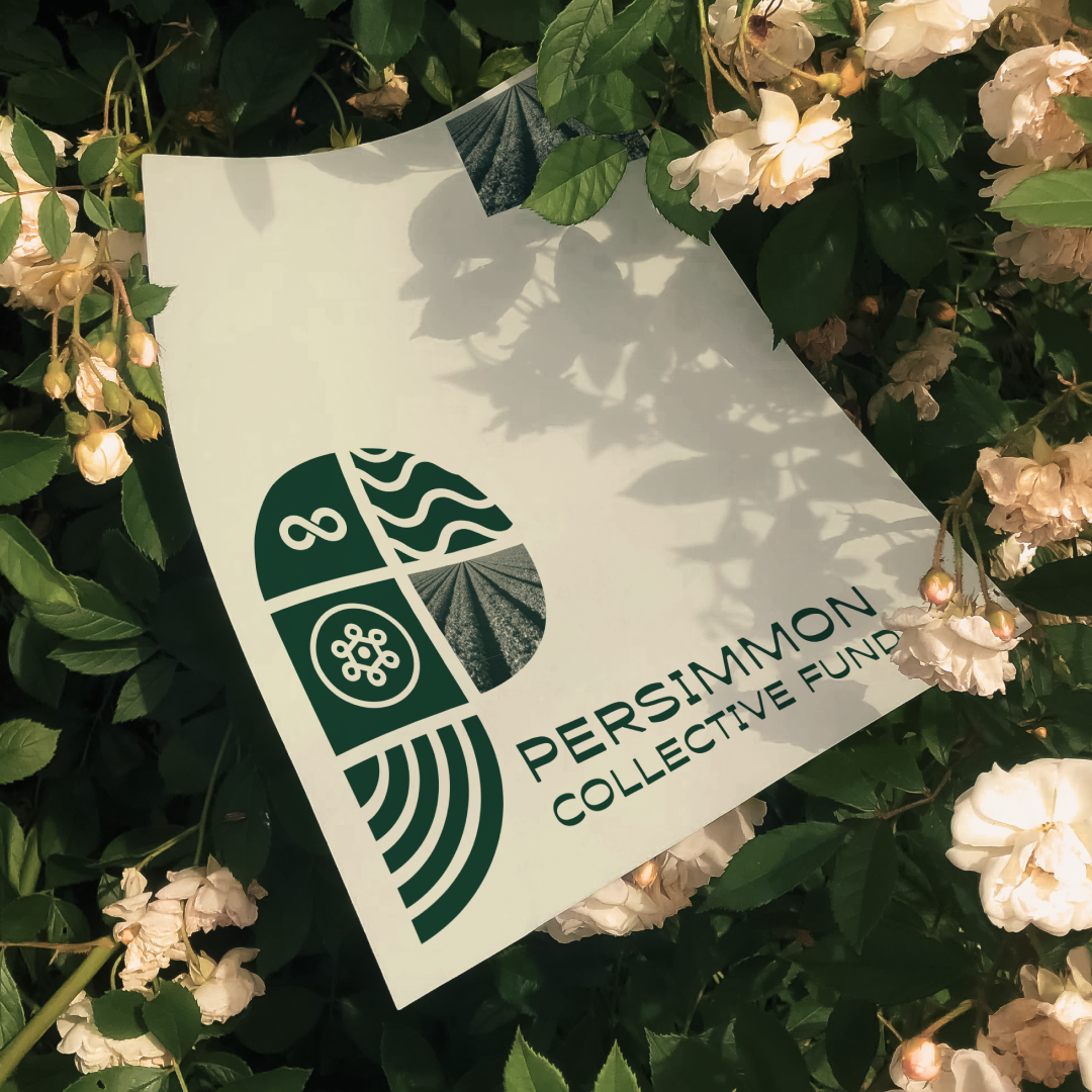
Persimmon Collective Fund
SERVICES
-
Visual Identity brings your brand to life with a complete suite of design elements, including a logo, brand marks, color palette, typography system, and more. We also showcase your new brand in action with mock-ups, ensuring it feels cohesive and ready to make an impact.
-
Our digital and print design services bring your brand to life with stunning, high-impact visuals. From logos, business cards, and brochures to web graphics, social media assets, and packaging, we craft designs that captivate and communicate your message effectively. With a focus on creativity, precision, and brand consistency, we ensure your materials look exceptional across all platforms. Trust our expert designers to deliver professional, innovative, and results-driven solutions that make your brand unforgettable.
-
Great design starts with a clear vision. Our art direction services ensure your brand’s visuals are not only stunning but also strategic and cohesive. From concept development to final execution, we guide the creative process to align with your brand identity and marketing goals. Whether it’s a campaign, photoshoot, branding, or multimedia project, our expert direction ensures consistency, impact, and storytelling that resonates. Trust our team to bring your creative vision to life with precision, innovation, and a strong visual narrative.
From Philadelphia
Currently in Brooklyn
Design More. Say Less.
Book a Consultation
info@sayless.studio


